Globo's checkout usability test
Collecting user feedback about the new payment experience
Design team
Antonio Duarte (UX Designer & Researcher)
My role
Planning, script, prototype, interview, moderation, analysis and documentation
Client
Globo
Year
2020
The problem and methodology
Before launching Globo's new checkout, the product design team wanted collect user feedback. To evaluate the usability of the new payment experience, I decided to create a prototype on Figma and run an usability test.
Due to COVID 19 restrictions, all tests were remote, using the Google Meet platform.
How I planned my work process:
• understand the research points and business rules
• choose the user sample and plan the script
• understand possible bias
• test and analysis
Research points
I paired with the PM and Product design team to understand the research points. Besides a brand new interface, that was the main goal of the study, I proposed the team to include a few points about user behavior such as:
• how often the users do online shopping?
• did they knew the product (Globoplay) before or they discovered when they navigated the landing page?
• what payment frequency did users prefer? Monthly, annual? Why?
• Do people feel safe to input payment data in Globo's checkout?
At this moment I knew the research wasn't only to test usability but also a chance to explore more about consumers purchase behavior, and an interview would be the best method to get this information.
After that, I started to understand about the interface and highlighting possible user tasks.
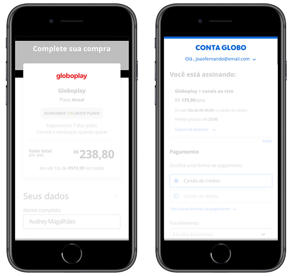
Old interface

New interface

The new experience brought up new components that made the interface more visual. It was important for the study to understand how fast the user would complete all fields to finish the purchase.
The user journey started in the Landing Page, with the user choosing a product to subscribe. Although the product team didn't have ownership about this interface as a digital product, it became part os the research because it was the sales touchpoint.
All research findings were shared with the respective team, to help with product insights.

Also, the new interface show more differences between mobile and desktop responsive versions. That was another key point for the research.

The product logo was replaced by a new brand to represent the Sales Platform, called "Conta Globo". The research wanted to analyze if that change called user's attention or if it affects negatively.
And the new checkout implemented a new feature allowing users to see their e-mail and change account while purchasing.
User tasks and possible biases
After understanding the research points explained above, I started to plan the script. One challenge that I had to face it was how to create a purchase context for the user, who wasn't actually subscribing any product for real.
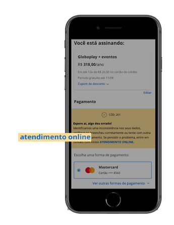
Because I was using a prototype, the user wouldn't input any real data and I was worried that they wouldn't pay so much attention in the payment form. That is why I decided to implement an error scenario to grab user's attention in fixing the mistake. This would make the person choose another payment option and repete part of the flow.
I decided to use the "speak aloud" method and give each person 2 main tasks:
1. Navigate in the landing page and choose a plan to buy
2. Pay for this product
The script flow
Usability tasks
Explore
Pay
Login
Error
Success
Break the ice
Interview
Quick chat to meet the person, and create empathy.
Understand about technology and online purchase background
Find a product to subscribe. This wasn't part of the new checkout, but it was important to create the purchase experience.
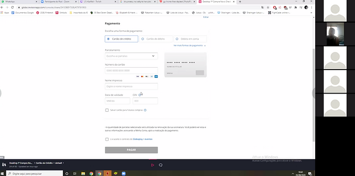
Each participant was asked to share screen so I could follow the use.
The sample*
• 5 Globoplay** subscribers, who have recently purchased
• 5 Non Globoplay subscribers with a free account
• half users
• 5 women / 5 men
• 24 to 61 years old
• Users form Bahia, Minas Gerais, São Paulo, Rio de Janeiro e Rio Grande do Sul
* An outsourced company was responsible for the recruitment
**Globoplay is the top streaming service from Globo

Research outcomes and learnings
• I documented the process and shared a PDF with videos and quotes to help the team to empathize with some findings
• 12 findings were highlighted for the product design team
• 3 of them were easily implemented before official launch and helped to achieve better results:
1. Improve the text legibility. Since the interface was basically white with grey texts, many users felt difficult to read important informations.
2. Avoid the highlight in the link to chatbot in the error message, this was calling much more attention them the instructions for the user to solve the problem by himself.
3. Some users missed seeing a security stamp to guarantee that they are in a safe space to put their payment data.